

The first wave of AI products all looked the same: Inter, a purple gradient, a chat box. The newer ones are picking type with more character. These four keep coming up.
| Font | Style | Cost |
|---|---|---|
| Geist Serif | High-contrast display serif | Free, from Vercel |
| Figtree | Friendly geometric sans | Free, Google Fonts |
| Switzer | Swiss neo-grotesque | Free, Fontshare |
| Brodine | Rounded geometric sans | Free for personal use |
Geist Serif
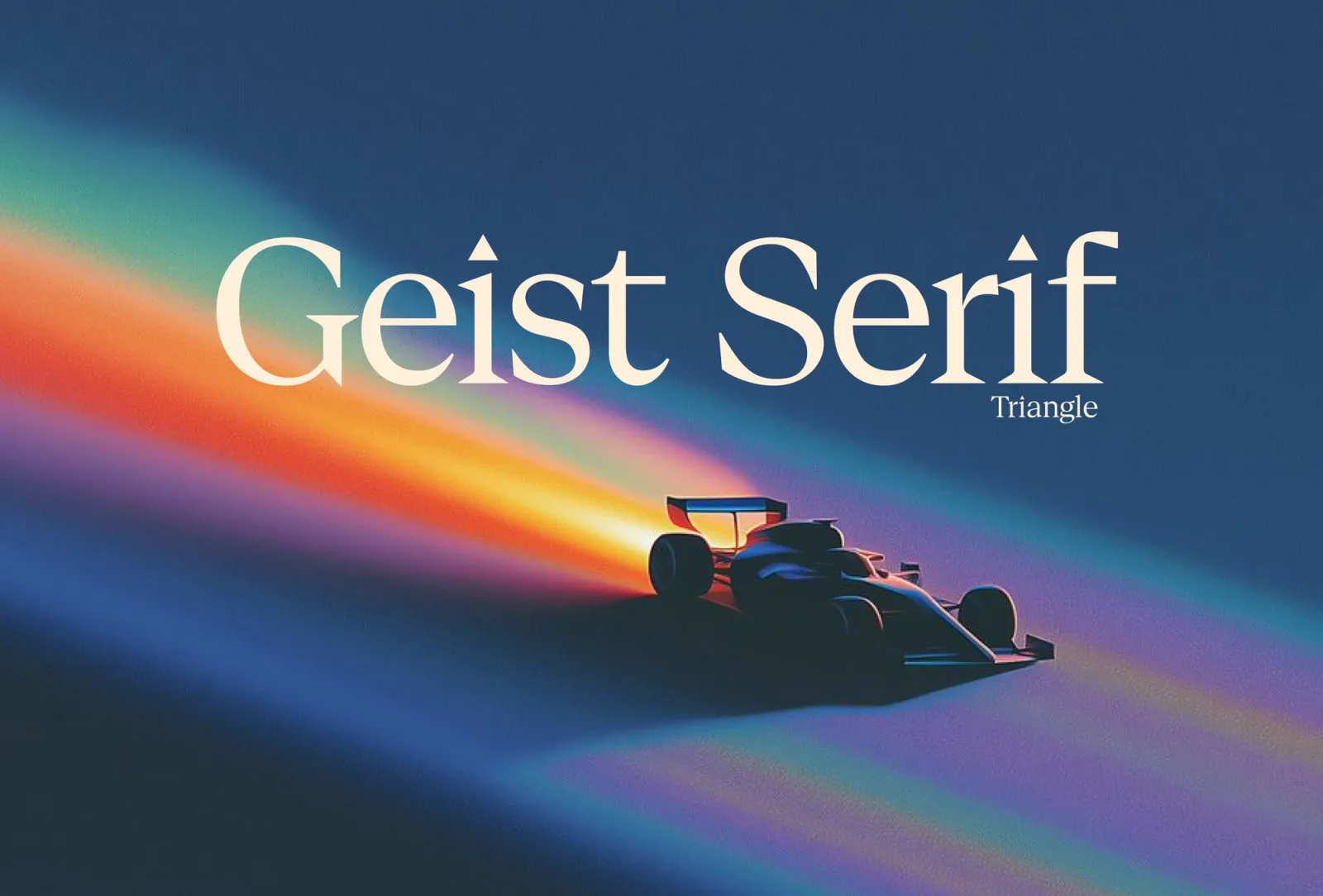
Vercel's new display serif, added to the Geist family next to Geist Sans, Geist Mono and Geist Pixel. It's high contrast and made for headlines, posters and other big sizes.
The detail people notice is the dots. They are a variable axis, so the dots on i, j and punctuation can be round, square, hearts or triangles, the Triangle style shown here and a nod to Vercel's logo.
Use it for: big headlines over Geist Sans text. It ships in Vercel's free geist package (announcement).
Figtree
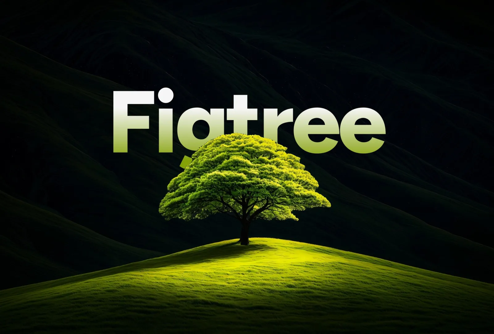
A geometric sans by designer Erik Kennedy, made for web and mobile apps. Clean but a little friendly, and very readable at small sizes. It runs from Thin to Black, with italics.
Use it for: app interfaces and body text, anywhere you would reach for Inter by default. Free on Google Fonts.
Switzer
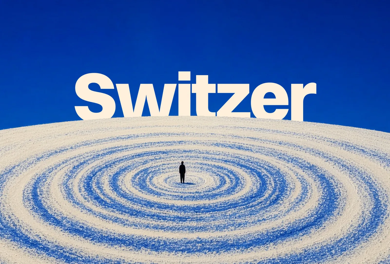
A neo-grotesque in the Swiss tradition from Indian Type Foundry, released in 2021. Neutral at text sizes, and its heavy weights hold up at poster size, like here.
Use it for: one-font sites where a single family does headlines and text. Free for commercial use on Fontshare; read the license there, since it limits self-hosting the files.
Brodine
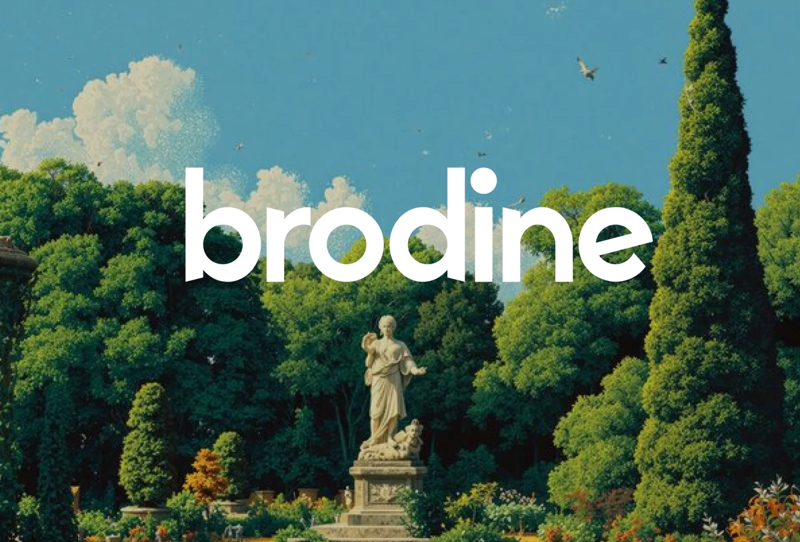
A rounded geometric sans with soft corners and round dots. It reads warm and approachable at large sizes, which suits companion and consumer AI apps more than developer tools.
Use it for: logos and big headlines, with a plainer sans for text. Free for personal use only; commercial use needs a license (Creative Fabrica).
Pairs that work
- Geist Serif and Geist Sans: one family, serif for headlines, sans for everything else.
- Geist Serif and Figtree: sharp headlines over friendly text.
- Switzer alone: heavy for headlines, regular for text. One family keeps it calm.
- Brodine and Figtree: rounded display over a geometric text face with a similar feel.
Whatever you pick, keep a real size gap between headlines and text. A great font set at 18px over 16px still looks generated. More on that in how to make your site not look vibecoded, and what the big AI companies use is in what fonts AI companies use.